Rado

FORM FOLLOWS FUNCTION, REIMAGINED

9_1920x1080

Client
Rado
Swatch Group

Role
Art Direction
Design

Expertises
Activation
Social Expression
Motion Graphics


Industry
Watchmaking
Luxury

Translating Modernism’s Poetry
The Rado brand, celebrated for nearly a century of innovative spirit since 1917, has consistently redefined contemporary design through its mastery of revolutionary ceramic materials and strategic collaborations with world-renowned designers. The brand’s philosophy, embodying the defiant mantra “If We Can Imagine It, We Can Do It,” served as the perfect ideological framework for its unique collection inspired directly by the rigorous philosophy, core design principles, and iconic colors of the Franco-Swiss architectural titan, Le Corbusier. This highly selective, minimalist timepiece collection was conceived as a profound and tangible homage to his masterful system of Architectural Polychromy and his foundational commitment to geometry and perspective, positioning the watches as wearable expressions of modernist theory.
The Geometry of Reverence
To effectively highlight the synergy between Rado’s innovative material science and Corbusier’s intellectual philosophy, I engineered a focused social media campaign designed to seamlessly bridge architectural history with cutting-edge product design innovation. The creative approach drew directly from Corbusier’s intricate artistic vocabulary and strict technical rigor, treating the timepiece collection not just as luxury accessories, but as conceptual expressions of modernist theory. The campaign transformed his poetic forms and strict adherence to fixed geometry into a series of highly dynamic visual assets, utilizing repeating geometric elements and vibrant, structured colors derived from his famed color palettes to convey depth and movement across all digital channels, effectively visualizing the complexity of his technical principles.
A Tribute to the Visionary
The result was a highly successful visual narrative that resonated purposefully across both the specialized luxury horology market and the broader international design community. The comprehensive campaign positioned the collection as far more than just a typical commercial collaboration; it was a profound, strategic tribute to both the architect’s visionary work and Rado’s relentless commitment to pushing its own creative boundaries. By deploying a sophisticated visual language rooted in modernist history and theory, the campaign effectively celebrated Le Corbusier’s enduring legacy while simultaneously reinforcing Rado's identity as a prestige brand capable of transforming complex, high-art concepts into beautifully designed, commercially successful products, cementing its stature as a patron of modern design.
BackCov_1_2560x1440-copy
2_1920x1080

DESIGN APPROACH

Where space and time meet

8_1920x1080
4_1920x1080
7_1920x1080

ARTISTIC RESEARCHES

A flexible motion language

Corbusier_Typo_W Corbusier_Typo_B

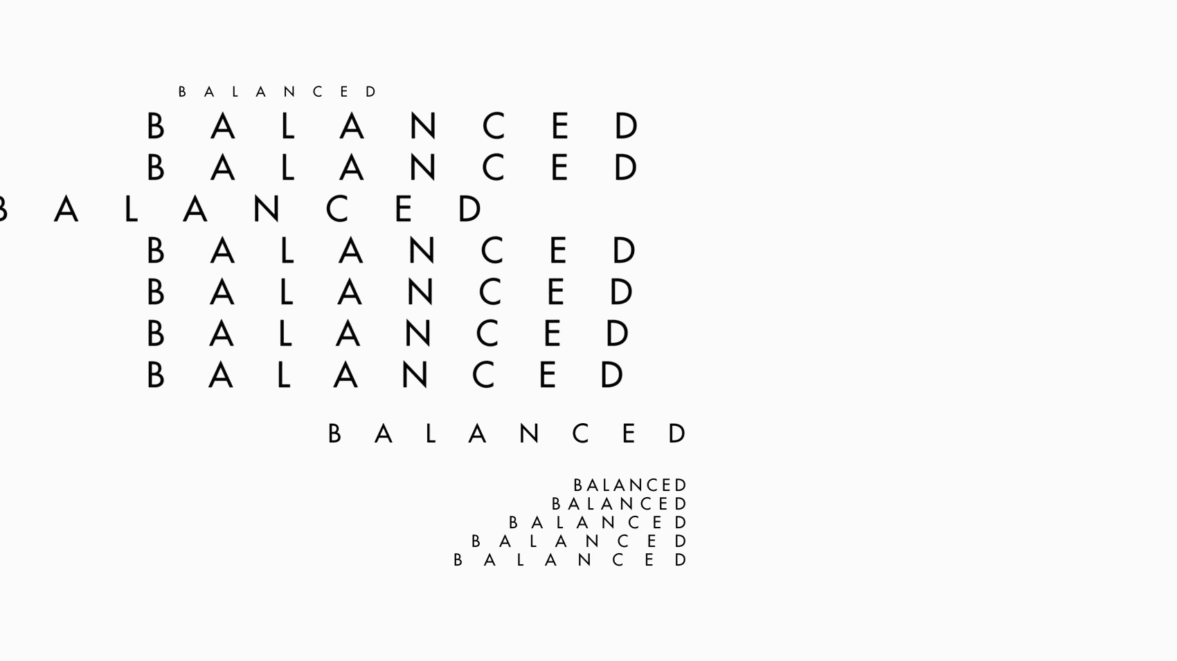
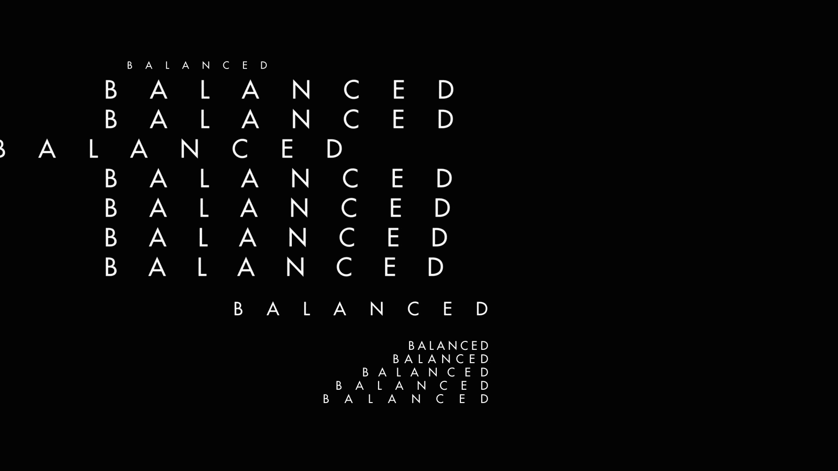
Kinetic animation makes the artistic language lively and flexible. The motion design reflects with subtlety and minimalism the keywords used.

9_1080x1080
8_1080x1080
7_1080x1080
12_1920x1080

The typography brings life to the constructions that evolve and change with time and movement.

2_Type_1080x1080
1_Type_1080x1080
BackCov_5_2560x1440-1

SOCIAL & INTERACTION

A social perspective

13_1920x1080-2
6_1080x1080-3

Instagram has been a key tool for this social media activation. The brand has thus generated a strong engagement with the design and architecture fans.

BackCov_7_2560x1440-2

Polychromatic Story

The stories provided the occasion to tease out the collection by engaging the public through questions and quizzes on color, form and preferred materials.

3_900x1792-1
1_900x1792
2_900x1792
9_1080x1080
8_1080x1080
7_1080x1080
CREDITS

Confidentiality
Credits are confidential for this project. Should you need any further information about the project, please do not hesitate to contact me.

Work    |    About    |    Contact

© 2025 Suleyman Yazki | Design & Direction